DEVELOPMENT
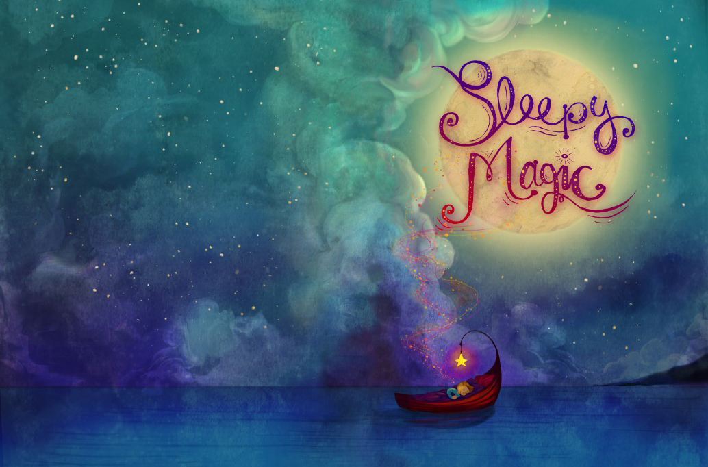
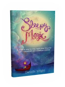
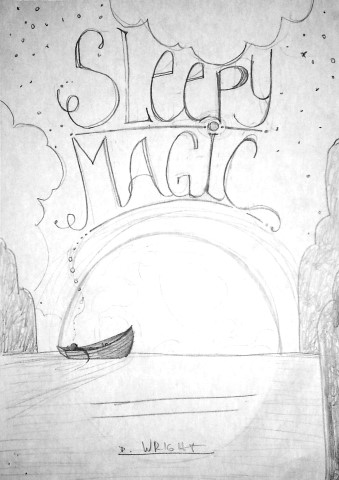
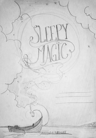
The Development from sketches to different colour feels, title designs and detail (deciding on more or less detail made a big difference here)
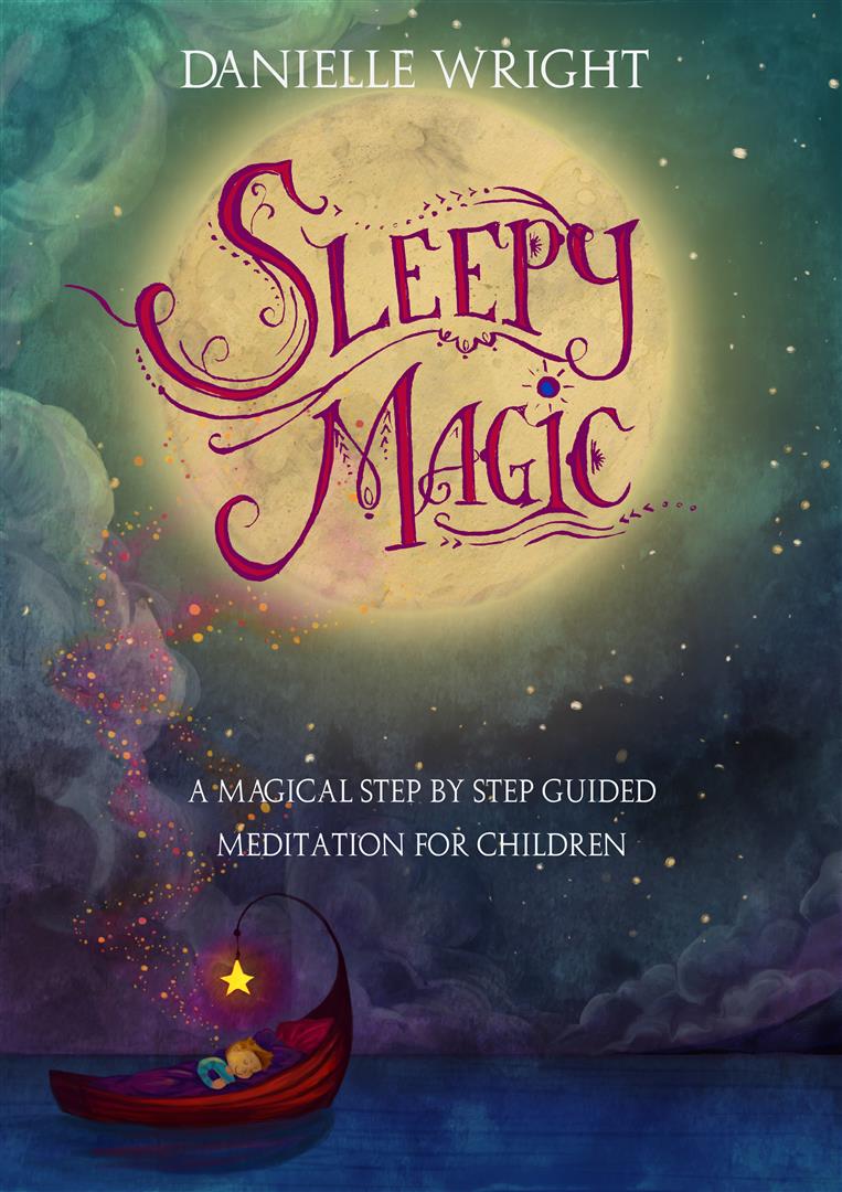
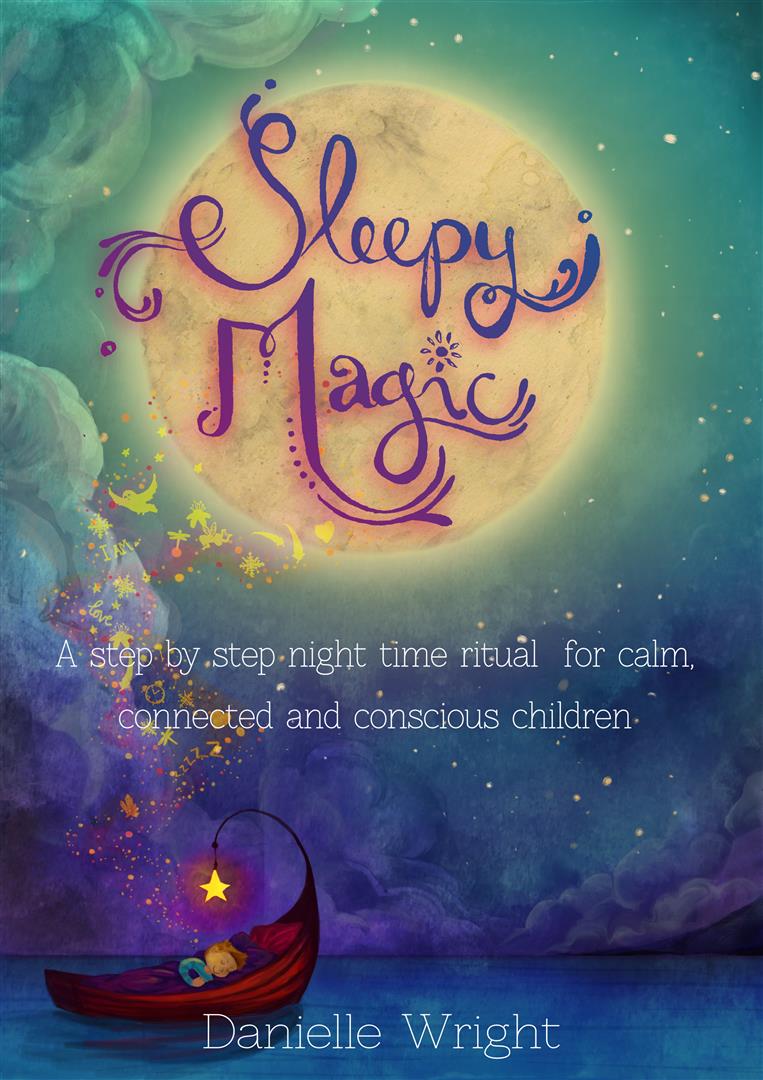
The development for the cover went through several layout designs and moved from a darker colour scheme to a more dreamy, blue toned one. We also tried different typography treatments until we reached the final version as well.
INNER ILLUSTRATIONS
On the inside, 3 stories are presented and accompanied by serene illustrations to help the children envision things.
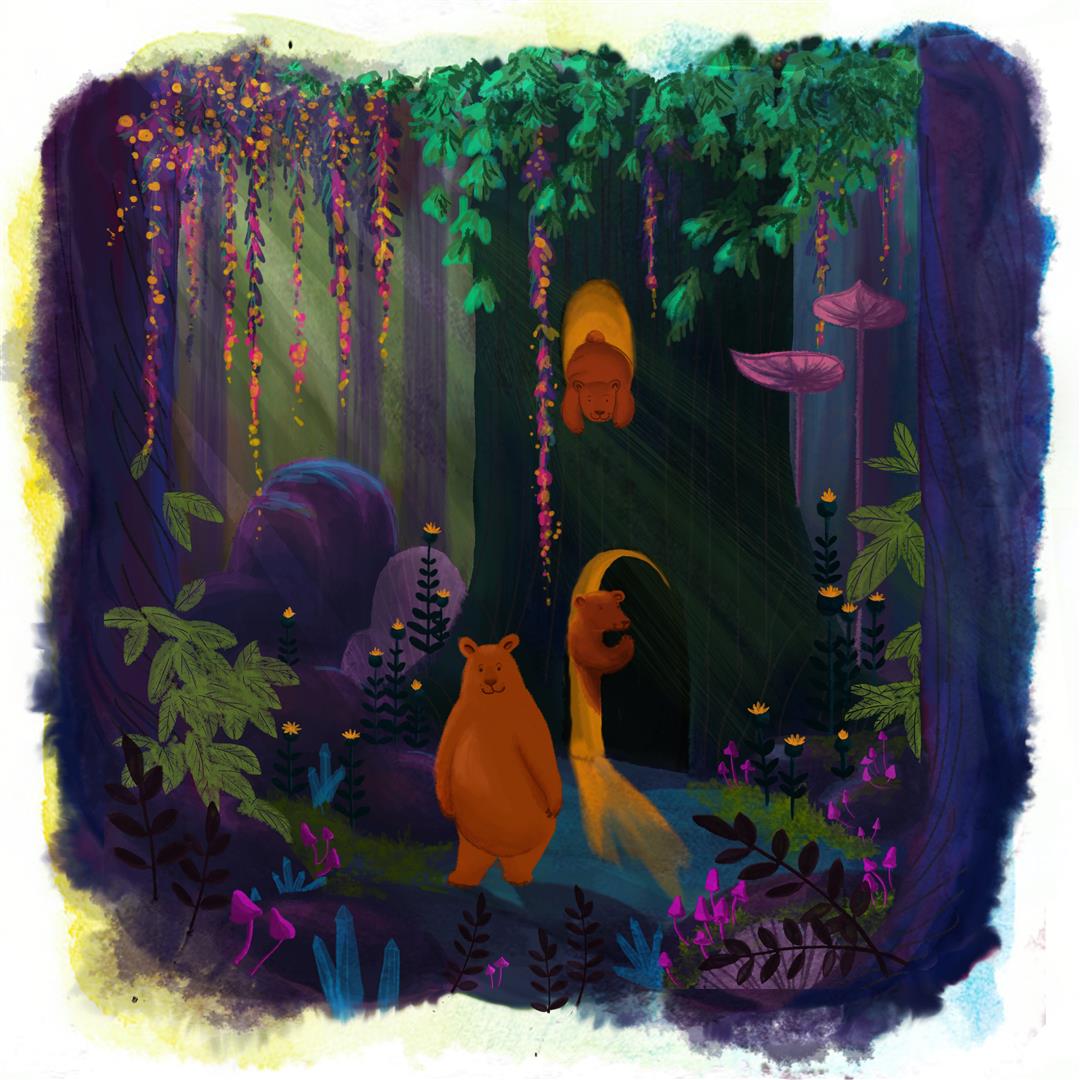
The bear illustration was to depict a cosy home for 3 bears who live in the forest amongst magical trees and plants. The evening setting enhances the sleep time feel and the golden light complements the darker jewel tones of a forest at twilight.
Friendly bear characters envoke the feeling of a happy, safe family.
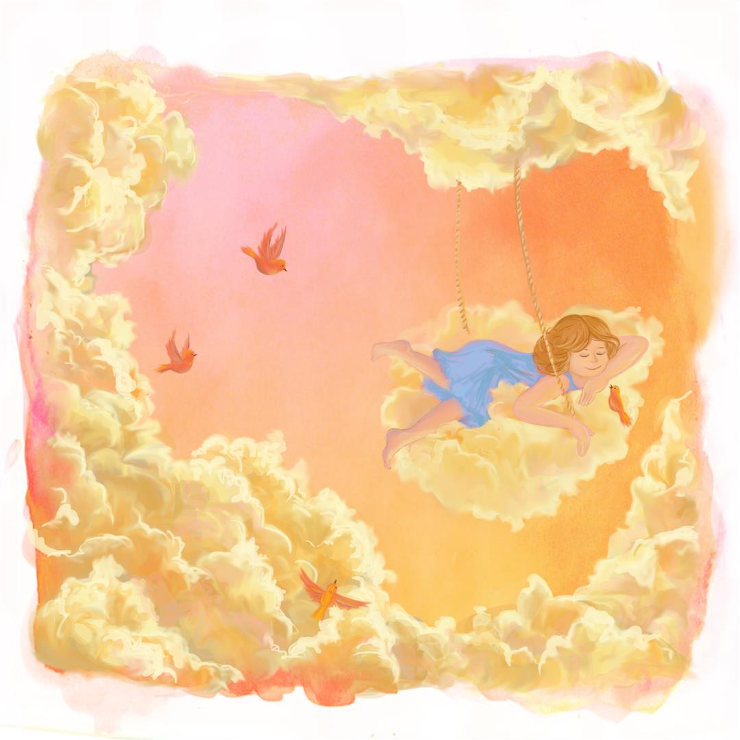
The cloud illustration is that of a girl sleeping amazingly well among the clouds. The golden, pink light from the sun gives a warm, safe and relaxing environment and the puffiness of the clouds invite to “jump in”.
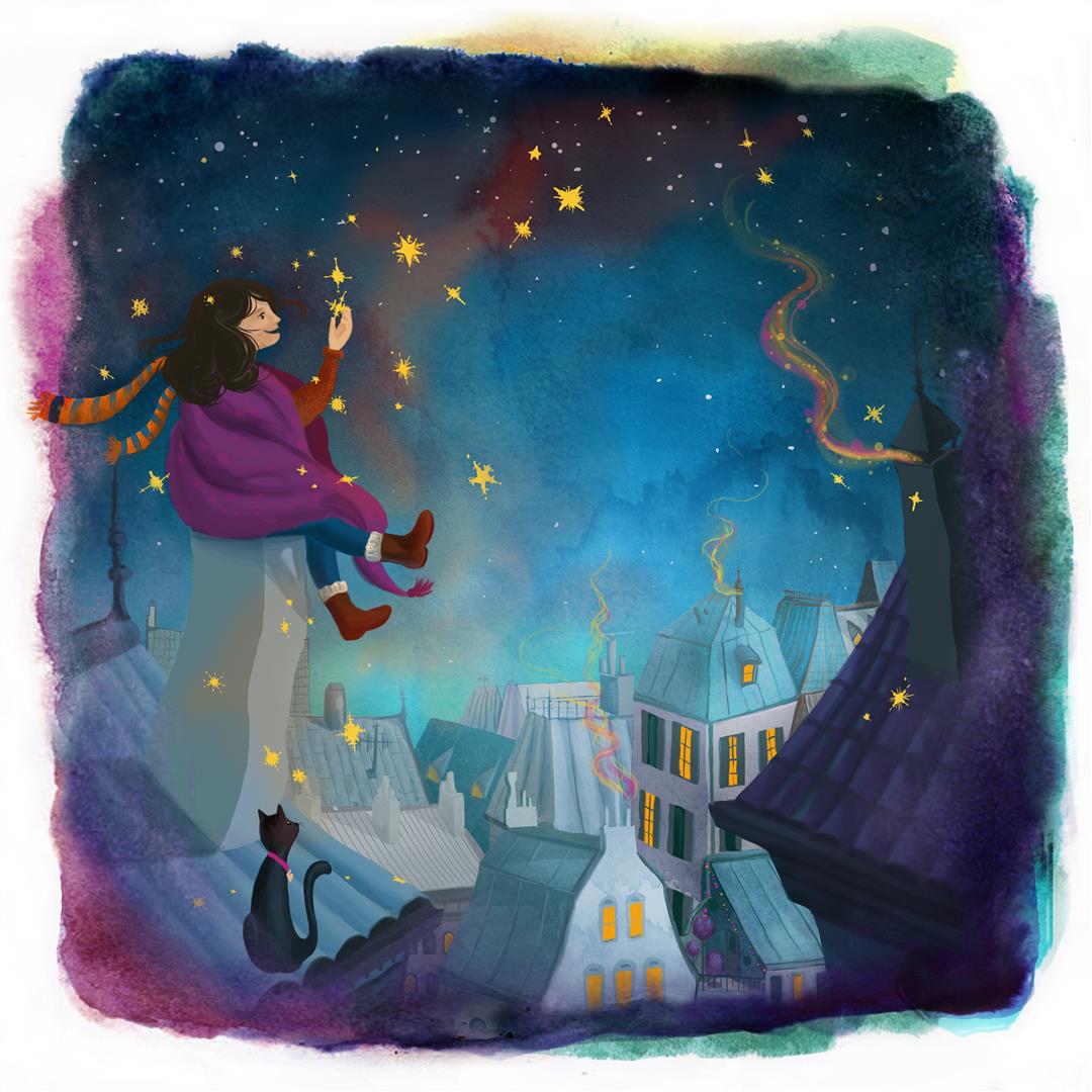
Looking up at the stars always invites for reaching out and “grabbing” them. The rooftop scene of a sleepy small town at night and a girl enjoying the view from the rooftops represents the open wide feel of a star watch. Her cat friend brings a bit of playfulness and her ease with which she just plucks stars from the top are to show how in your mind everything is possible.
END PAPER ILLUSTRATION
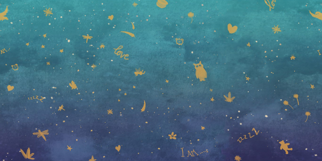
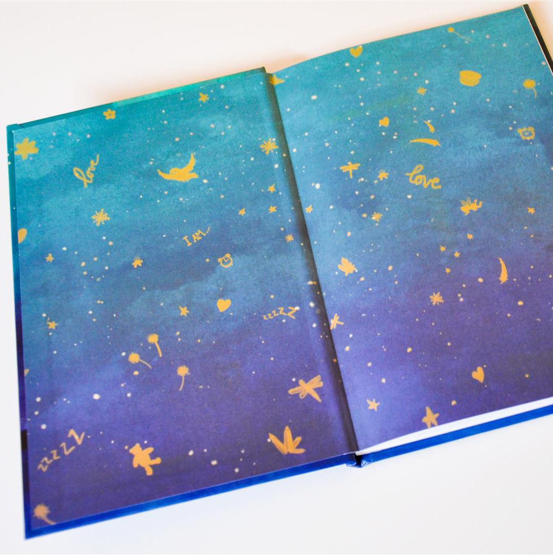
On the inside, 3 stories are presented and accompanied by serene illustrations to help the children envision things.
The hand illustrated logo for Sleepy Magic
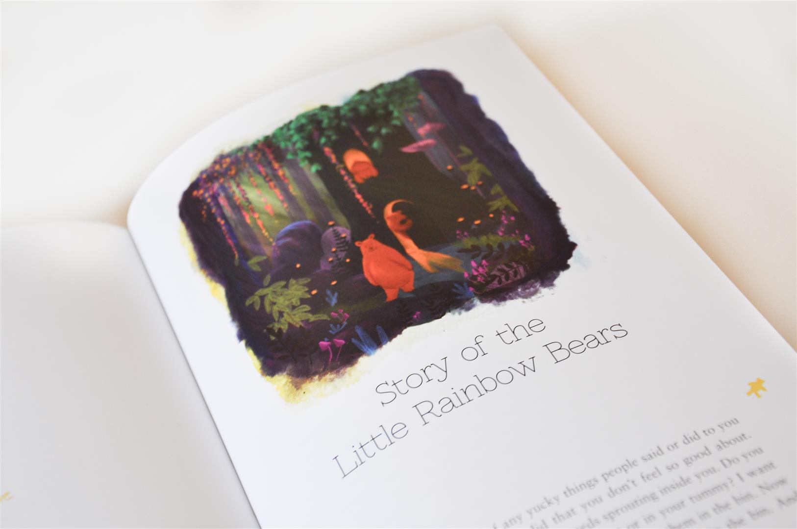
How the illustrations integrate into the book
