THE BRIEF
Amanda is a dating coach who focuses on women looking for fulfilling relationships. She had written a book based on her own experiences of sub-par dates that never led anywhere. She has created a new process that helps women to stop dating f*wits, according to her own words.
Amanda had a strong titled book that needed a strong cover. Her favourite and brand colour was turquoise, so she was looking if she could include that. The interior of the book had to be designed as well, as it had several action steps and activities.
THE PROCESS
THE COVER
I created first some concepts that had visual support for the title. They were playing on the frustating feeling of being upset with all the previous matches that never worked out. The book has a fun, bold attitude and I wanted the cover to hint at that.
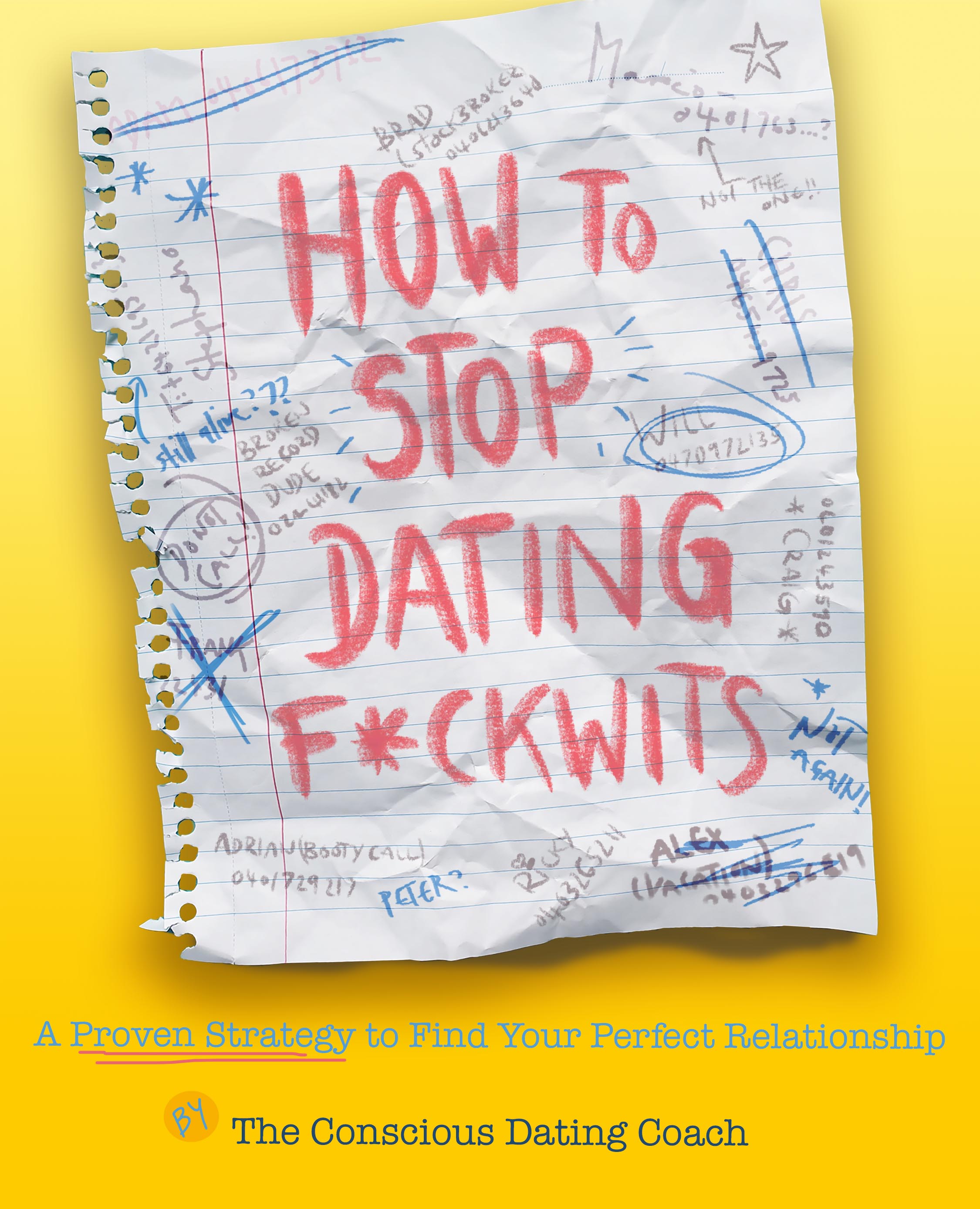
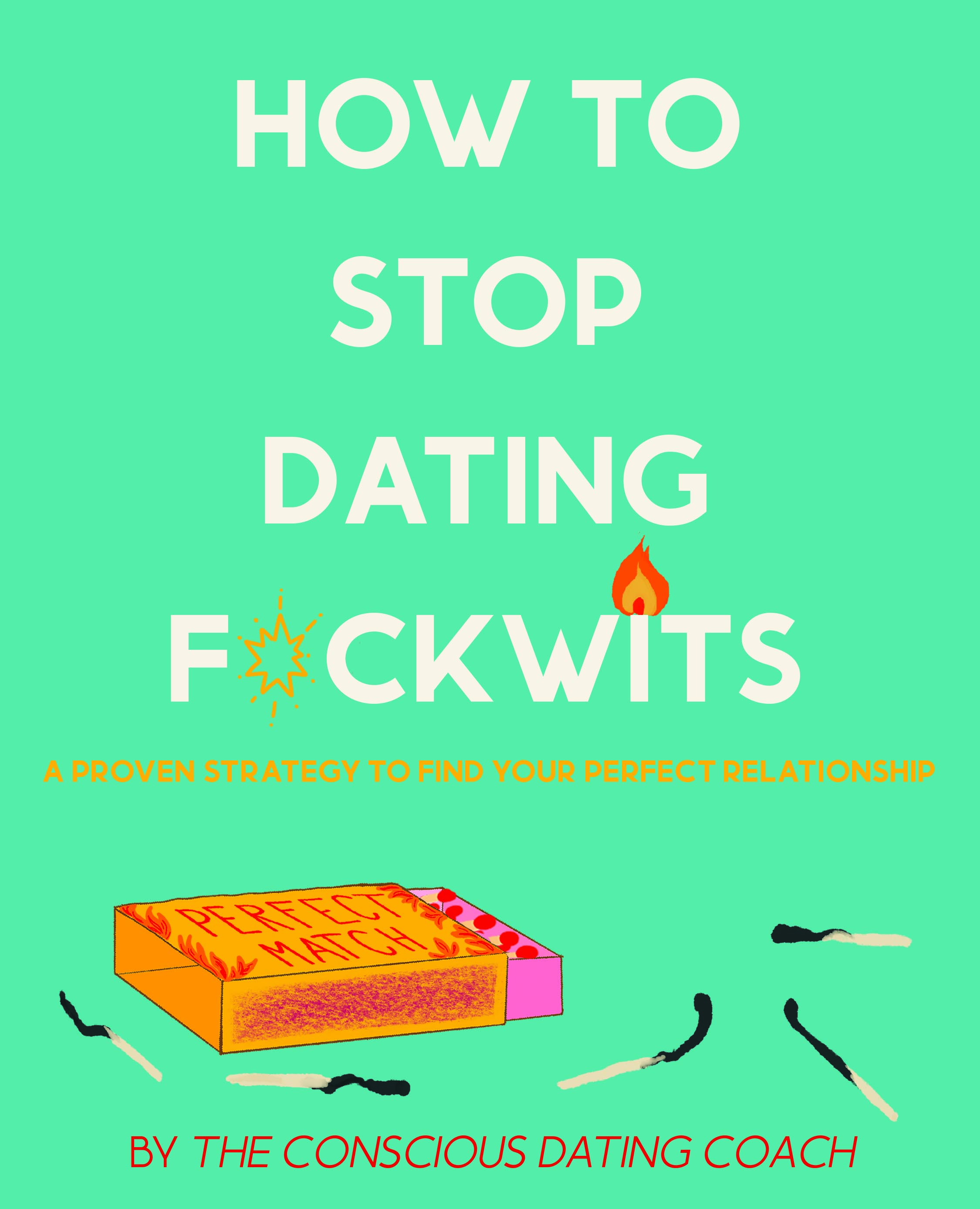
After review, Amanda decided to go forward with a text only cover, so that it would be as impactful as possible without any distractions. I created another round of 2 concepts for her.
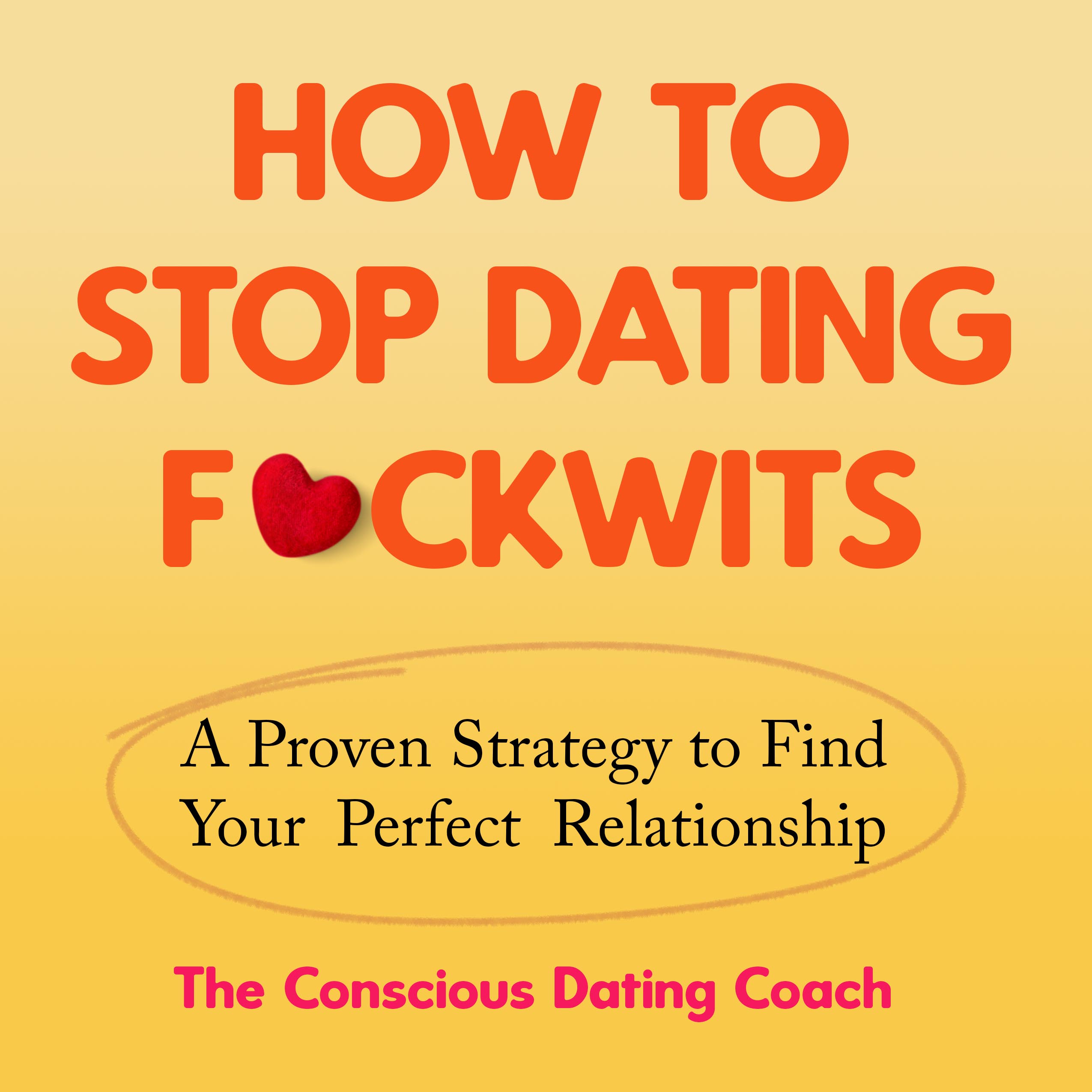
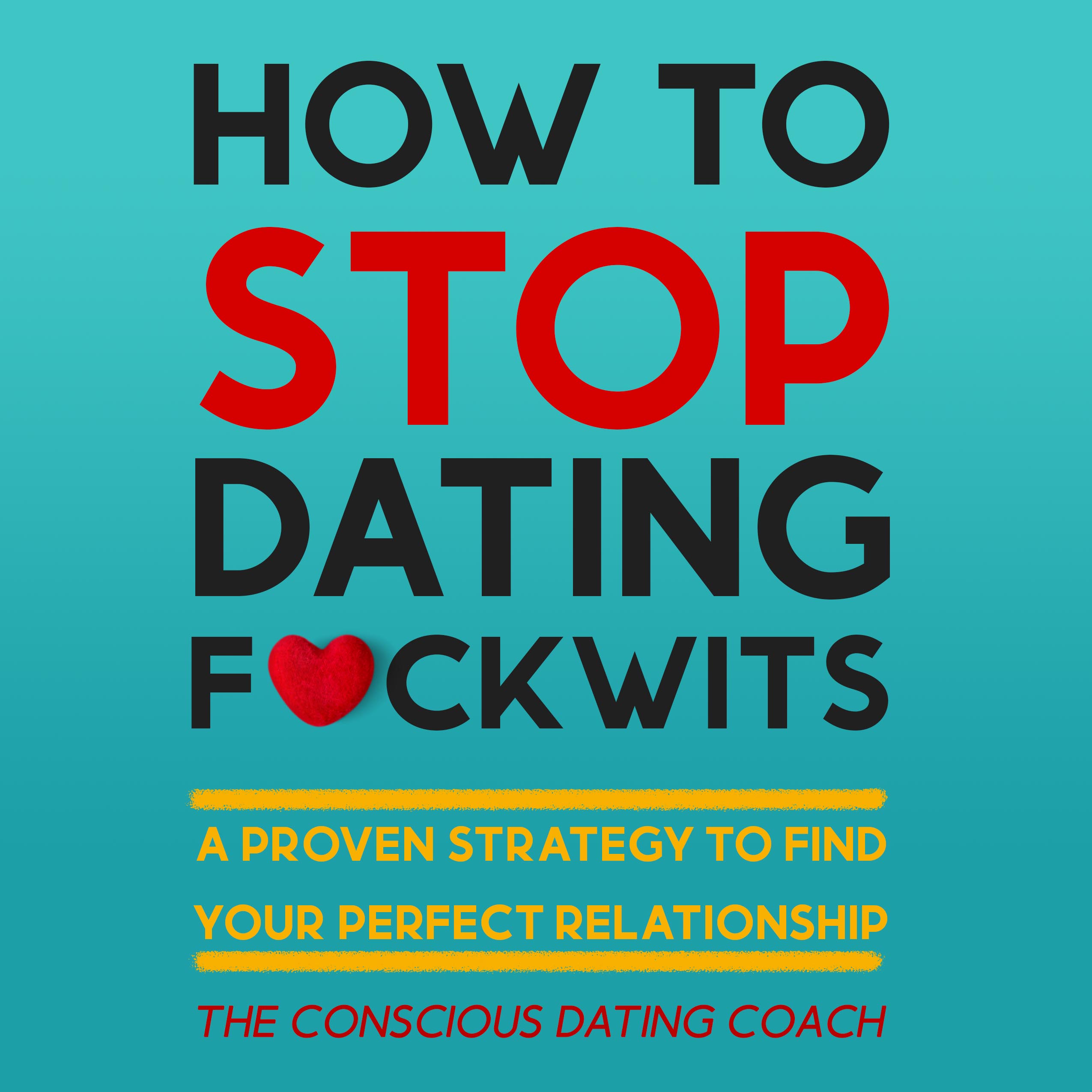
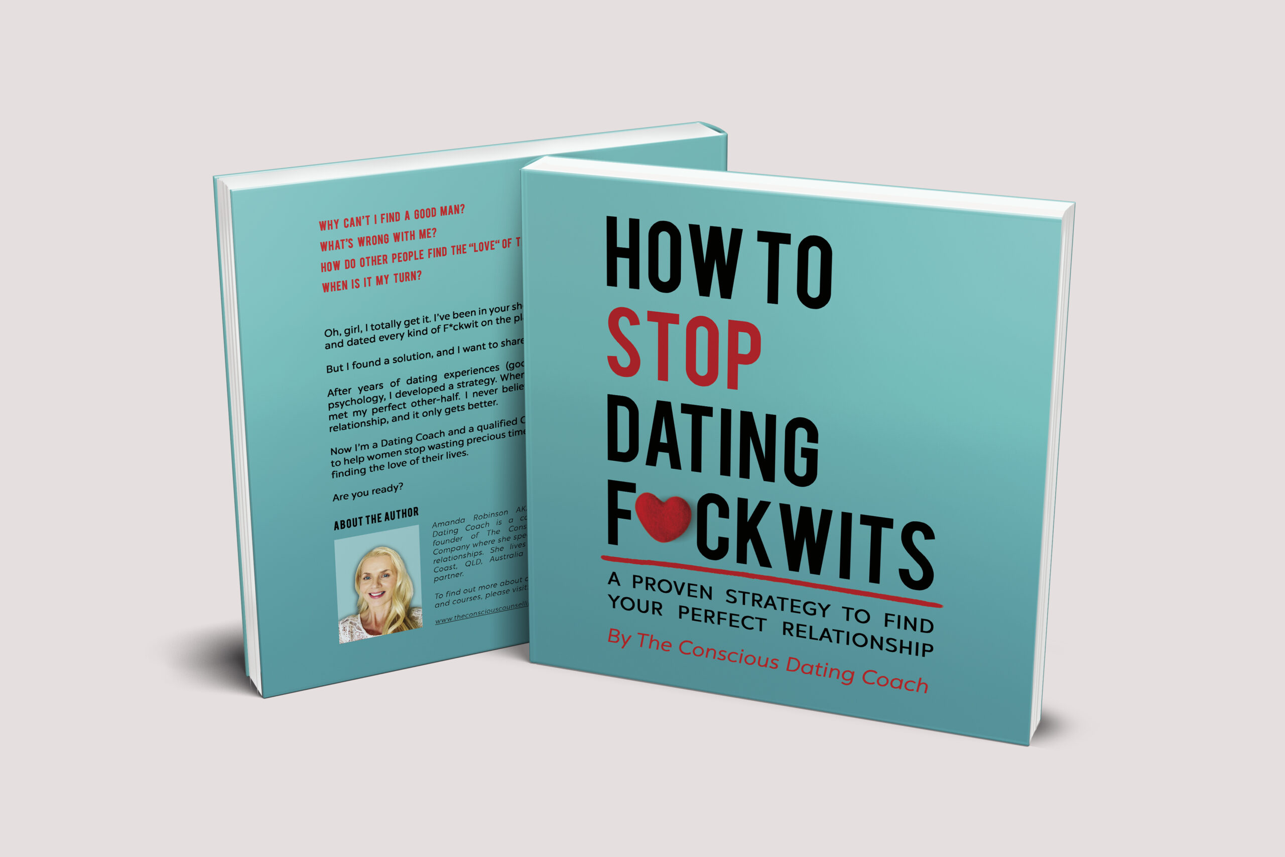
This next round was received well and she decided to go forward with the turquoise option and a few tweaks to the layout of the text and fonts.
THE INTERIOR
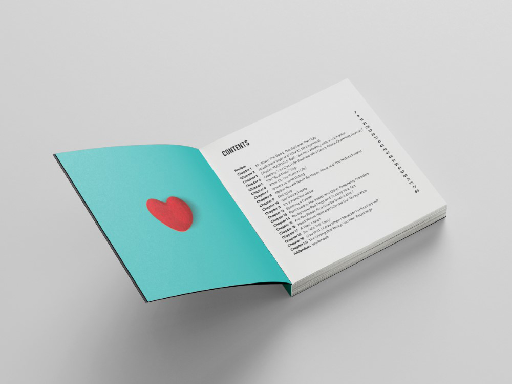
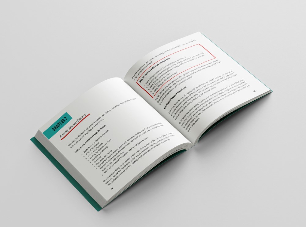
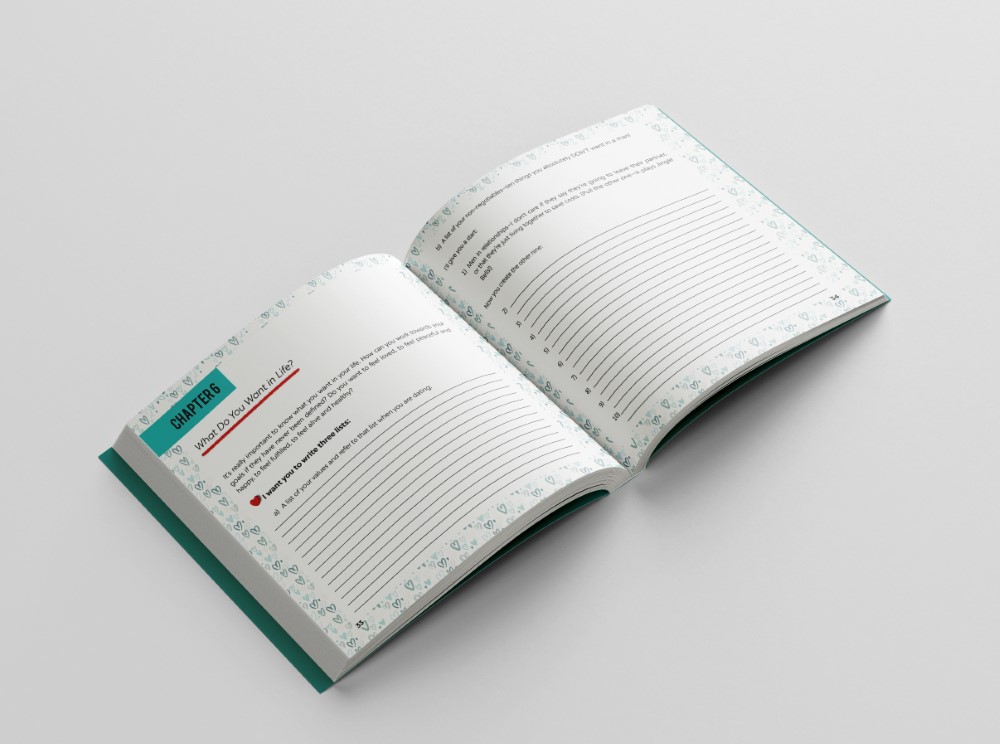
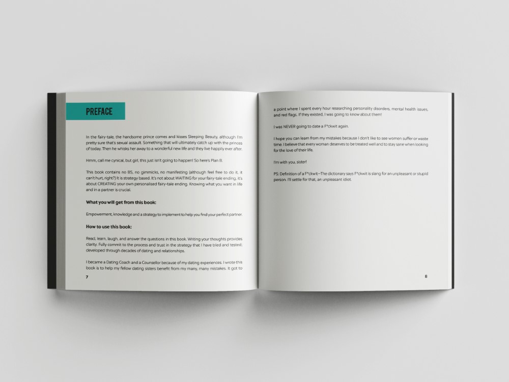
For the interior, I took cues from the cover and used matching fonts, the underlined text and red and turquoise colours. The book has several workshop exercised which needed special graphic treatment. The whole book is cohesive.
THE RESULTS
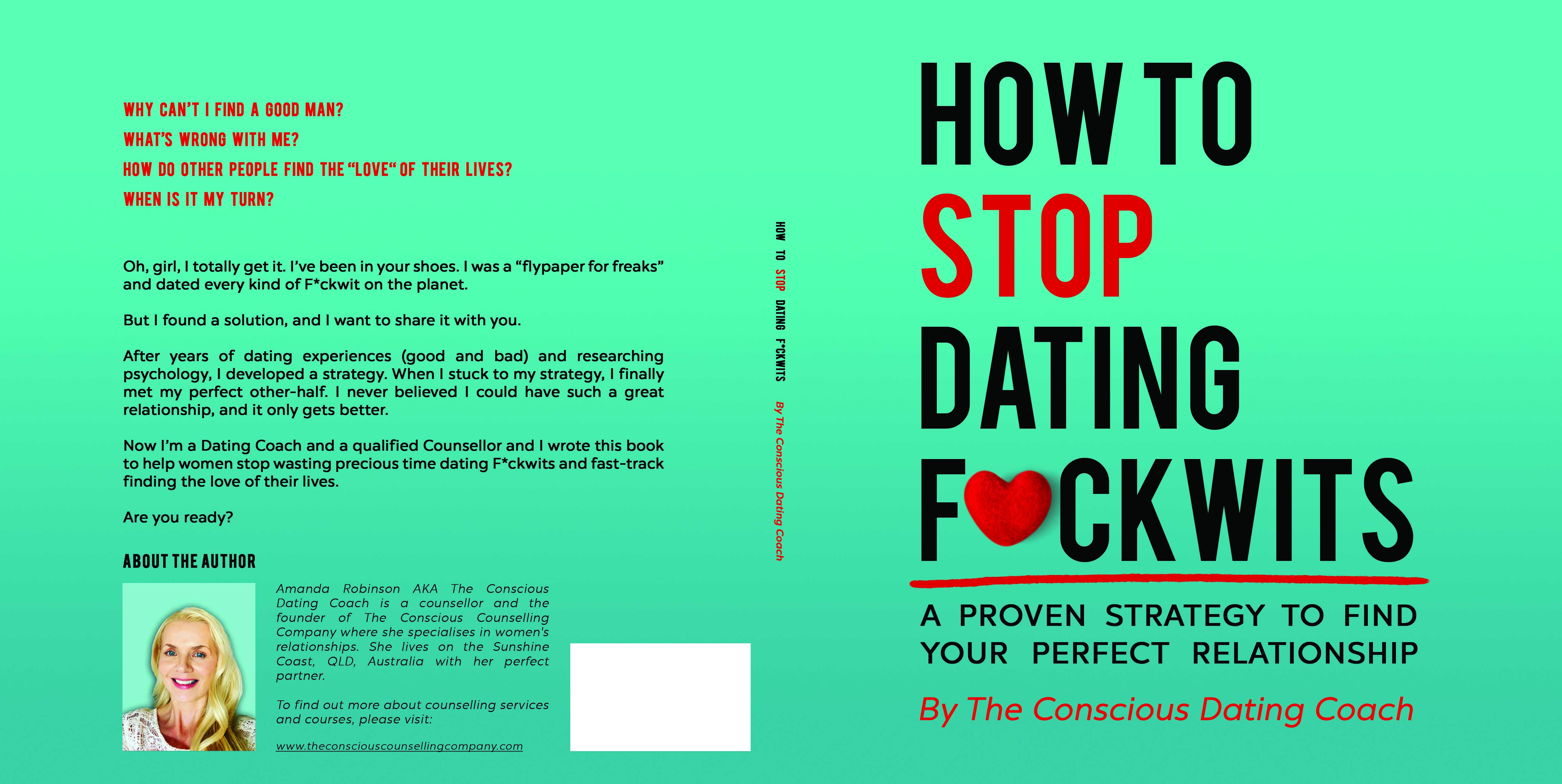
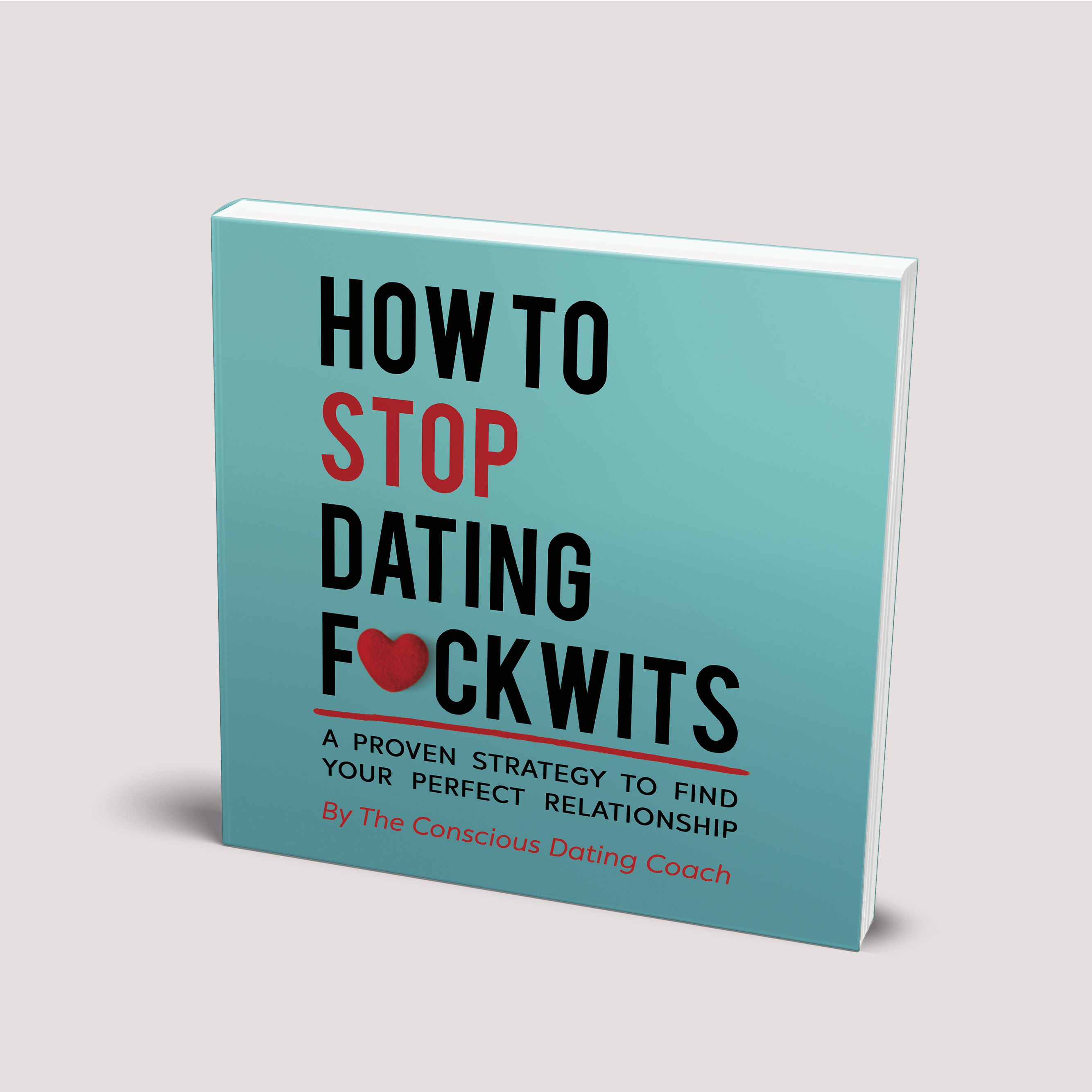
The final cover has a text only cover, that stands out boldly and keeps it positive, as it hints at the love and dating aspect with the cute little felt heart. The turquoise colour is bold and a complementary colour to the red.

The book was successfully launched on both Amazon platforms and Ingram Spark.
