THE BRIEF

Previous cover design
Rachel is an angel medium and had written a book for people who are more sensitive (in many ways) to the world than others. The book had been published previously (see left) and Rachel wanted to relaunch it with a cover that reflected her brand better and spoke to her audience more. She wanted to include teenagers and people who respond to soft and light-hearted approaches and the current cover did not reflect that as much.
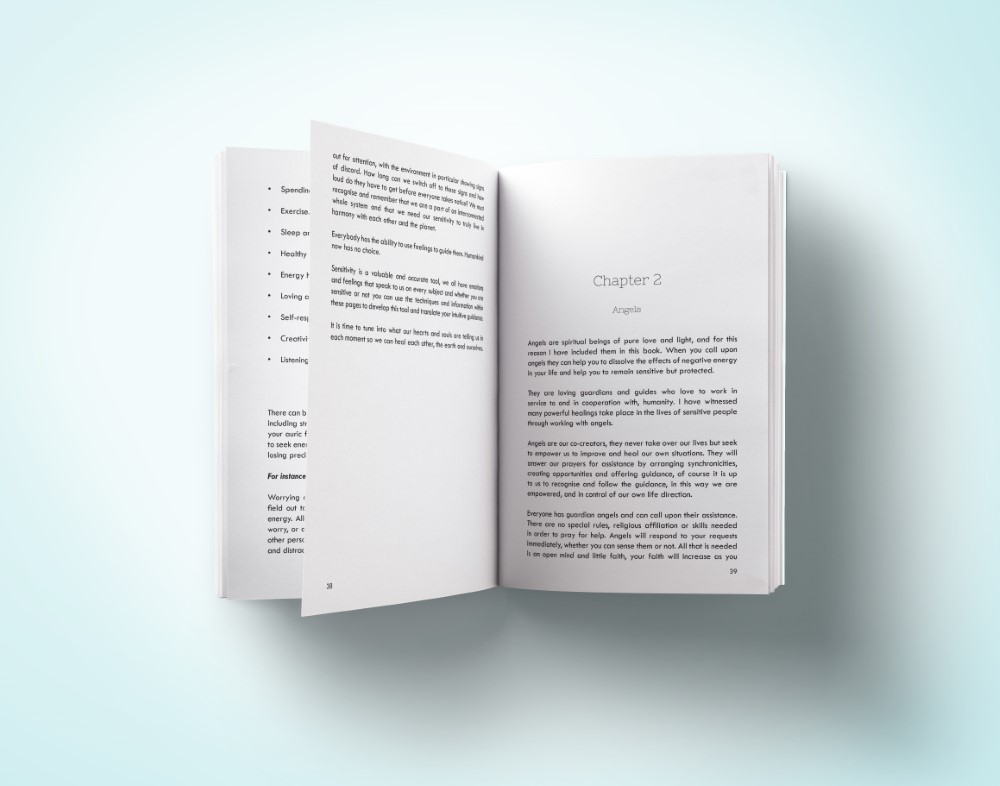
I also was tasked to create the interior from scratch again, as her previous files were for pdf only and could not be used for Amazon KDP publishing. I set out to match the interior to her new cover in the best way possible.

THE PROCESS
THE COVER
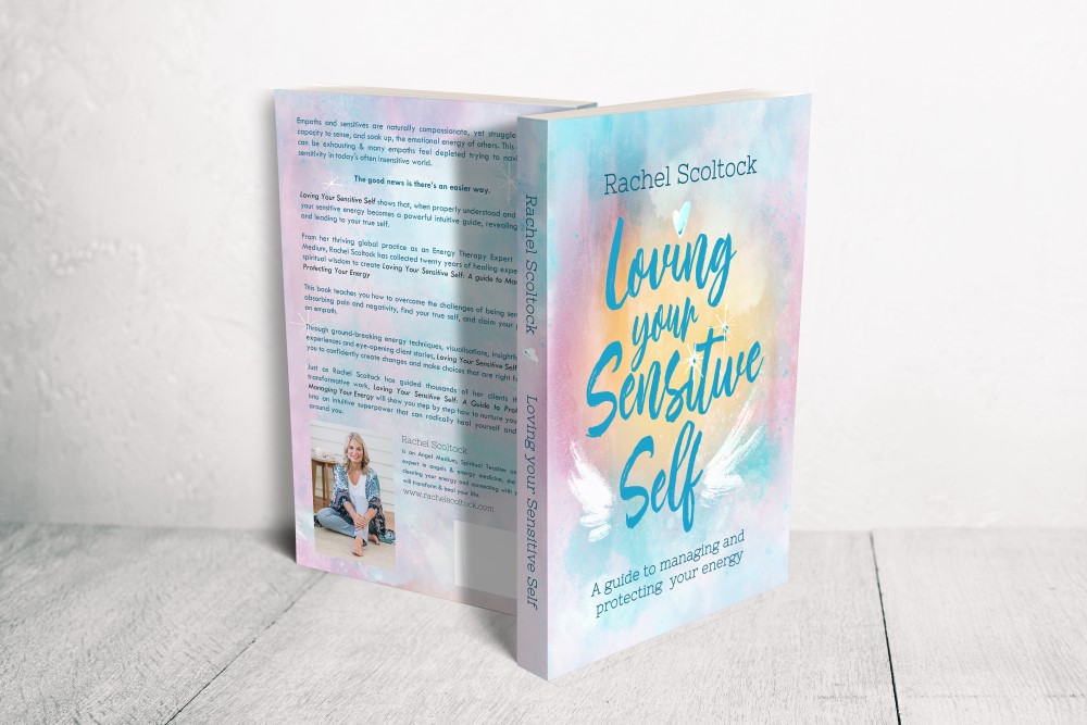
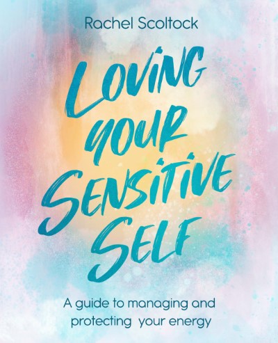
After creating some concepts for Rachel, we decided early on that a mainly text based cover was the goal, with “sneak peeks” of the topic to show up as decorative elements only.




I set out to create a texture and background that feels light and airy with a glow that can reflect the energy emitted by beings. Since the book is leaning on angel support, I also added wings, but in a loosely drawn, almost doodle – like way, to make it youthful and accessible.



THE BOOK INTERIOR
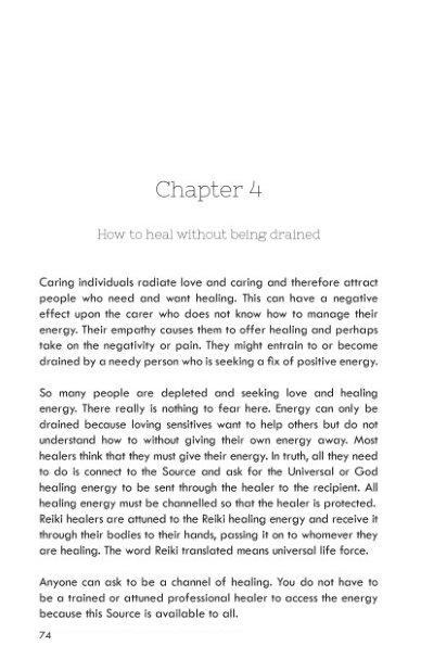
The interior followed the cover and reflects the style with similar and matching fonts, some small symbols and a clean, modern layout.

THE RESULTS
A modern, fun and light reimagining of the original! The book cover has had great feedback from Rachels clients and the whole spirit of the book has been uplifted. A great success for the relaunch of the book.


The book was successfully relaunched on both Amazon platforms and Ingram Spark. The client was really happy about the relaunch and readers seem to connect with it too!
