Collaborations aren’t easy but doing them with your family is kind of asking for trouble. Funnily enough, I didn’t even consider that when my sister offered a collaboration to work on a brochure project and I am glad I didn’t as it actually went amazingly well!
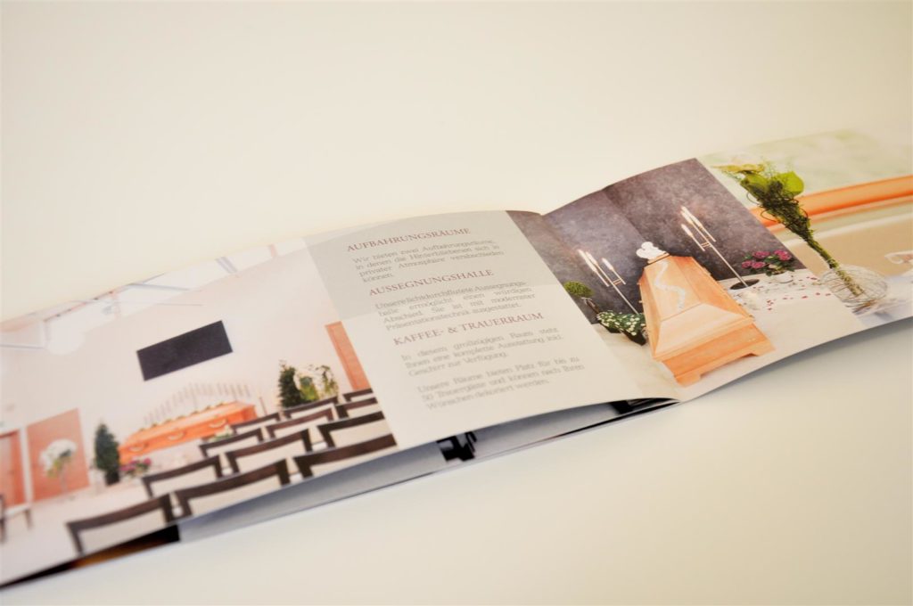
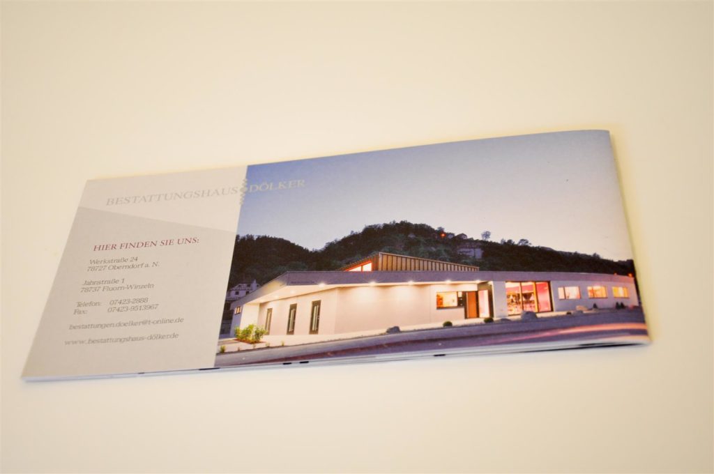
The brochure was to be for a funeral company which had built a state of the art, brand new and modern event centre for all things related to funerals. It is a wonderful space with great architectural design, lots of light and a fresh and professional feeling. There are several rooms and halls that can be used for anything customers may need, even a self catered kitchen and coffee hall.
To promote this building and its services, the company “Bestattungen Doelker” needed a brochure that matched the high standard of their new centre.
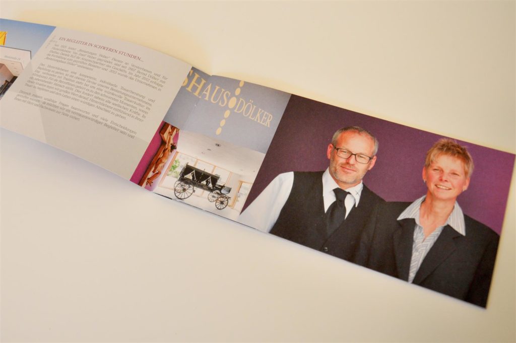
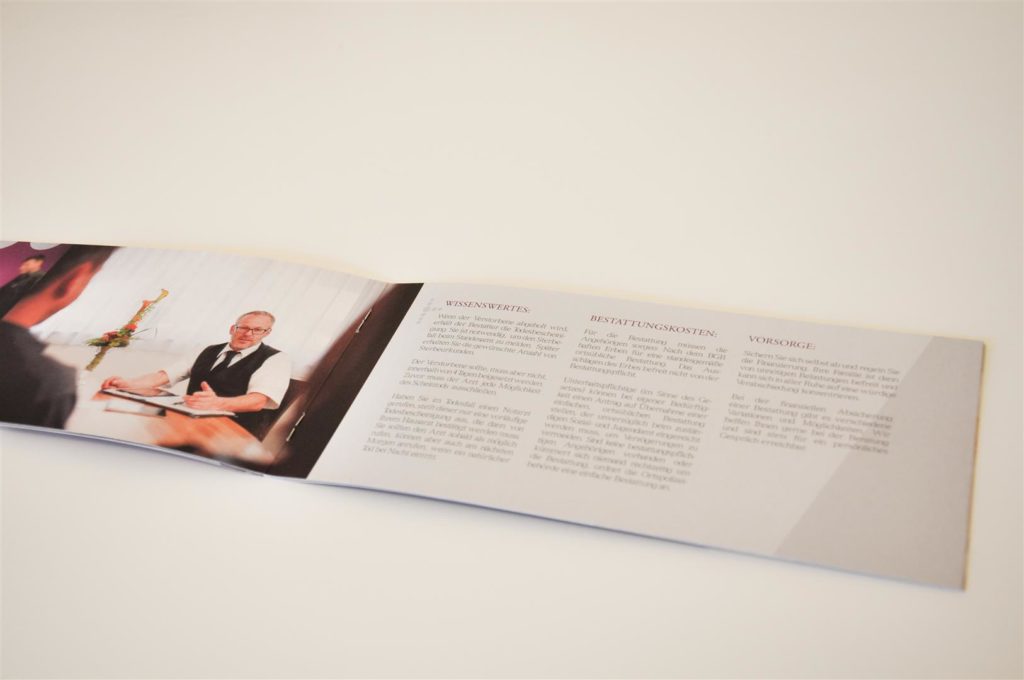
My sister and I set up meetings with the client to establish their needs and collect all the existing content, such as copy and logos that were needed. She then organised the shoot after I had planned out a rough layout of the brochure and discussed all the image needs with her. The photos really are half of the success of this project and she did a great job at capturing the company, its culture and the building.
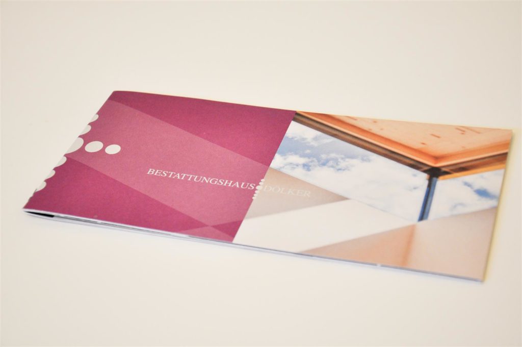
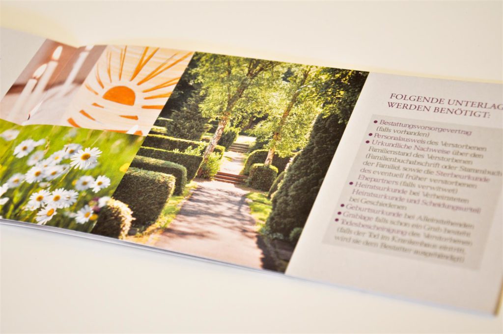
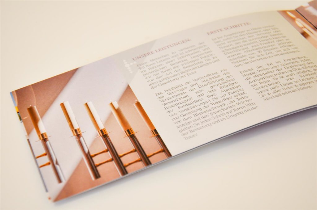
On my end, I worked on the layout where the challenge was to incorporate a lot of text and images without overcrowding the piece. I worked with tones of light grey and let the pictures breathe and speak for themselves. By colour coordinating them, they flow well throughout the brochure but are still relevant to each part of the content. A classic typeface and simple graphic elements support the text and look professional without overloading the page. The front cover is a strong geometric design with a symbolic image of a window corner with sky while the back page shows off the beautiful design of the whole building. This way the brochure has a strong effect if it lies face up or down.
